Facets' Cloud Cost Explorer
Designing an intuitive and comprehensive cloud cost dashboard to help DevOps Practitioner, Engineering Leads and Senior Management monitor, analyse, and optimise cloud expenditure.

My Role
Product Designer
The Team
Myself, 1 Product Manager, 2 Engineers
Timeline
Dec 2023 - Feb 2024
Cost Explorer was the most highly adopted feature. 8 out of 12 total clients (now 17) running their infrastructure on AWS adopted the feature right away and reduced their cloud spends by 70% in non-production environments.
Click here to see the final designs.
The Problem
DevOps and Engineering teams find it difficult to track their cloud spends, leading to inefficiencies and overspending. This lack of visibility and control over cloud costs hinders their ability to plan effectively and optimise spending. Through discussions with users, the following key problems were identified:
How can users manage their cloud spends more effectively by planning better and not waste money?
How can users see cost related information in a simple and intuitive way that is both granular and digestible?
The Research
My research revolved mainly around cost or billing dashboards of platforms like Amazon Web Services and Google Cloud Platform. I chose these platforms for their industry dominance and their comprehensive billing solutions, which serve as benchmarks for tracking and managing cloud expenses effectively.


Through discussions with my users, I gained a clear understanding of their requirements and pain points. Some of the key questions I asked, which were thoughtfully answered by my users, included:
How often do you check your cloud cost data and export it?
"Very Frequently. Cost data is used by all of us here at Capillary to plan our quarterly or semi-annually spendings. Having this is going to be a major boost for us as it'll reduce our dependency on other platforms."Currently, how tedious is the process of tracking costs? Do people own the cost factor of the environments they launch?
"Really Tedious. Cost is mainly the concern of Ops folks but by having a universal dashboard or something similar could help in developing a sense of ownership in everyone despite their roles and help us save some money."
Based on my findings, I came up with the following user personas:

Infra Team Lead
Concerned with making sure his team stays within budget, while making sure the infrastructure is scalable and reliable

Head of Engineering
Concerned with planning of Ops related activities like number of environments, cloud choice etc.

Chief Technology Officer
Concerned with planning the budget along with other leads and implementing the best practices
While these dashboards have complex data and advanced filtering, through user interviews and competitor analysis we came to a conclusion that our users needed:

A way to figure out the total cost and trend of a project

The cost breakdown and trend of the environments in a project

The cost breakdown of resources provisioned in an environment

Ability to filter between different environments and resources
Ideation and Design Process
Brainstorming
Through brainstorming we're able to come up with different ideas of visualising data. We finalised two ways of doing so namely, pie chart and line graph.
Why Pie Charts? Pie charts can show multiple environments in an easy and intuitive way as compared to a bar graph where you have to compare the height of bars. We also considered the idea of using a Tree map but didn't go ahead with it since it is not a widely use way to show data
Why Line graphs? Line graphs are a great way to show upward or downward trend in a period of time by showing the flow directly where as in a bar graph, a user has to visualise the line and connect the gaps between every bar to understand the flow.
Open Questions and Answers
These questions came out as a result of my research and ideation phases and were shared with the Engineering team and Product Manager working with me.
.jpg)
User Journey
To enable users to access this feature, they were required to modify specific scripts within their project settings to activate the Cost Explorer. To expedite the feature rollout, we initially decided to have our on-call engineers assist users in integrating the script directly into their projects.
.jpg)
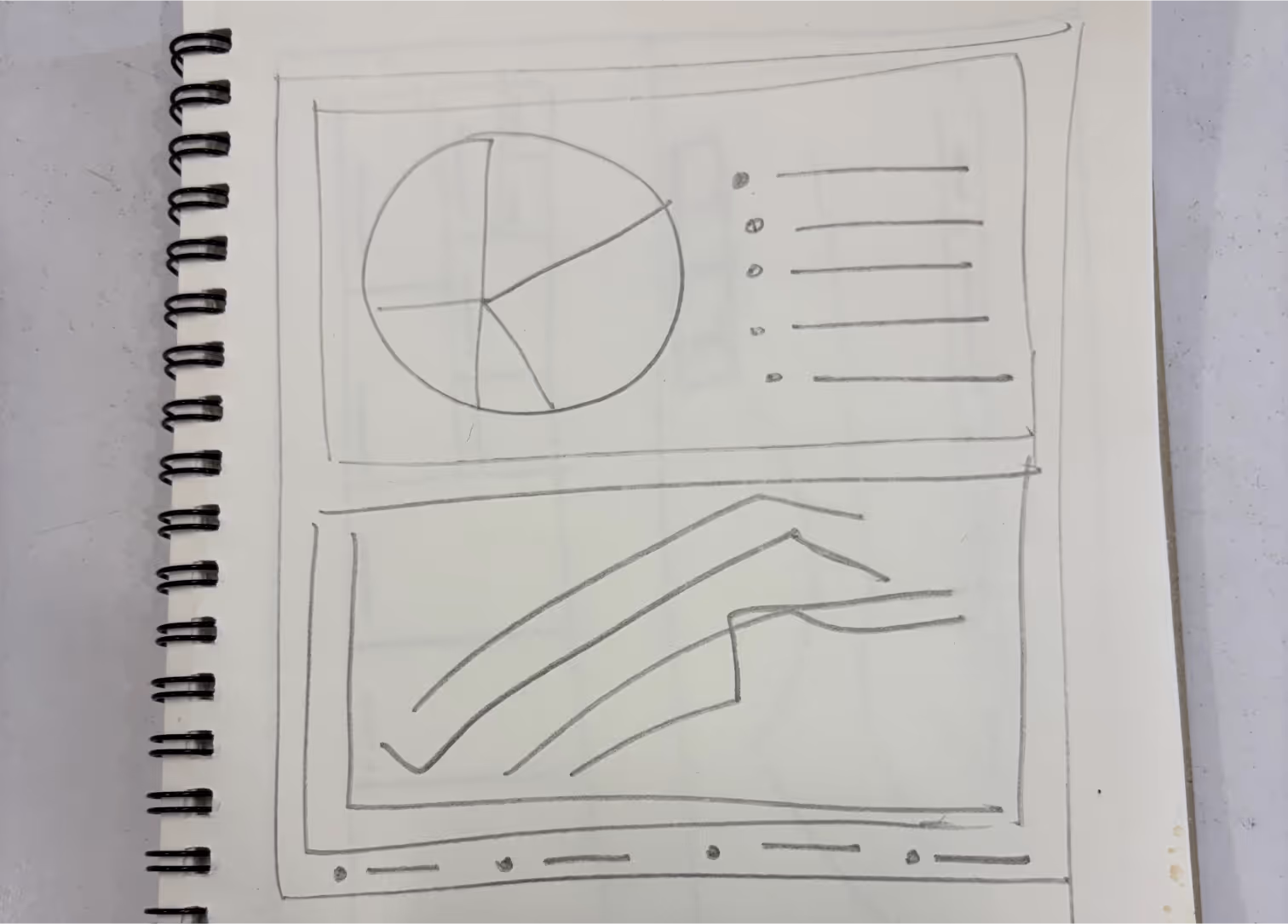
Wireframing
My personal preference for low-fidelity wire-framing is using a notepad and a pencil as it leads to more ideas as compared to technical platforms like Figma, Miro etc.


Collaborating with the Developers
Once the mockups were completed and approved, I handed over the designs to the developers, providing a detailed explanation of the interactions and nuances included in the mocks. During the development process, I collaborated closely with the team, ensuring that the designs were implemented seamlessly and providing feedback for iterations until the final product matched the vision.
The developers leveraged the existing design system, which I had also designed, to build reusable components like cards, ensuring consistency across the product. For graphs, I actively contributed by identifying the ideal library that closely matched the look and feel of the mocks, simplifying the development process while maintaining the design fidelity.
This experience not only helped refine the product but also deepened my understanding of how engineering teams utilize design systems and technologies like frameworks, APIs, and libraries to bring designs to life.
Results and Key Takeaways
Cost Explorer has been the most successful and widely adopted feature ever launched by the team at Facets. We achieved the following results:
The popularity of the feature allowed us to release the following enhancements in the next quarters
Support for Google Cloud Platform and Microsoft Azure
Cost details of specific resource types and resources in an environment along with the ability to download a CSV for the same.
Budget based alerts which notified the users if a environment crosses a certain budget threshold.
Finally, I learned that building complex infrastructures to support apps and websites is inherently challenging, and adding the element of cost management makes it even more difficult. A good infrastructure must be scalable, reliable, and cost-efficient to meet user and business needs effectively. The Cost Explorer feature has become one of the most valuable tools for our users, delivering an instant and tangible impact. I am proud to have contributed to its design and development, knowing it has made a significant difference for our users.